Spotify, two stage edit
Users find it difficult to sort and organize their playlists in a simple and easy way. I came up with a new concept within the Spotify app to enhance the flow to add, remove, and edit your playlists.
My role
Timeframe
platform
Course
1.
User insights gathered by survey and qualitative interviews gave me an understanding of user interactions with playlists and the resulting problem space.
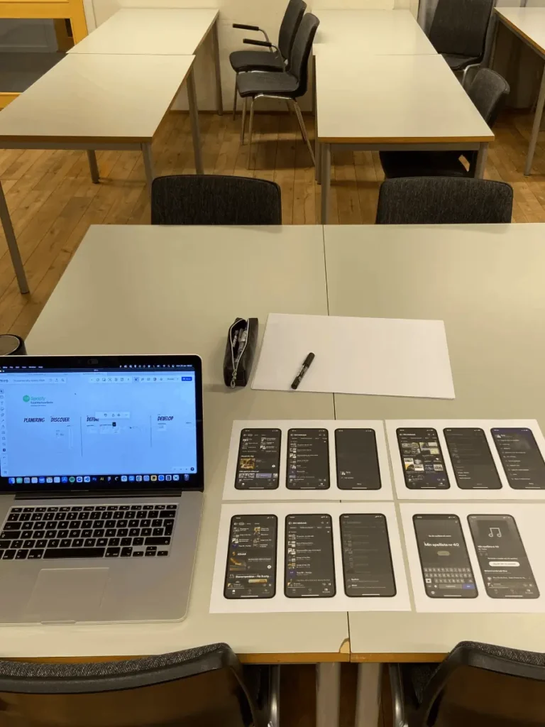
The prototype is made in Figma according to Spotify’s existing UI.
2.
I chose to start with a blank slate, without any specific direction, and instead have a long, thorough research period where I gather users insights through a survey and 15 structured qualitative interviews to identify an existing problem. I started to group my research into four different areas.
Research
3.
I got 16 insights for Playlists but the thing I don’t do and thats a huge learning for me is that I didn’t control this insights and realized that there is functions that actually already exists on Spotify but the user don’t know how to access the function or how to use them.
So it was time to make usability tests to see what users knows and understand about playlists. This was also necessary for me as a designer to understand in order to create concepts and improve the playlists.
4.
In this stage I wanted to understand how the users use Spotify and identify potential pain points that could occur within a playlist. I conducted 5 usability tests. Do users understand the UI and related functions? They get two tasks to complete. I observe, record the screen and takes notes.

Usability tests
5.
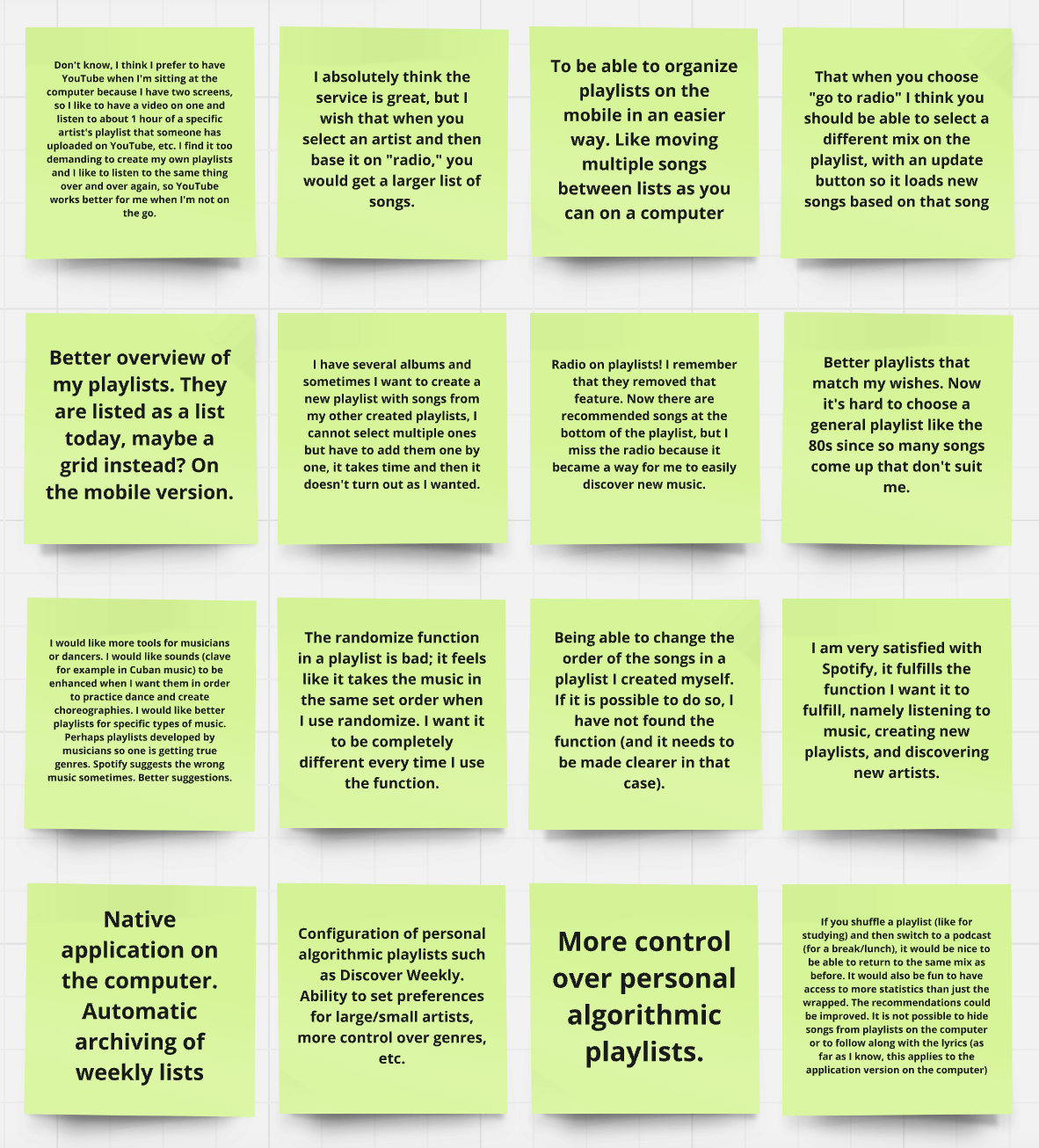
Many of the features that users say they can’t find or claim don’t exist actually do exist when I go into the structure and functions of playlists myself.
The work takes a turnaround.
How you actually use Spotify will determine the
functions you understand and can locate functions in the interface.
We can see three different users with three different behaviors.

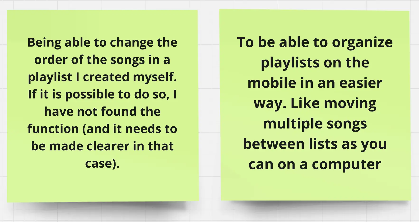
“I have one playlist since I got Spotify. I put all of my songs on that list and then press play and use the shuffle function.”
“Organize I think it’s quite messy. Haven’t tested and I have so many playlists that I can find it. But I don’t usually organize mine in any way”
“I don’t create playlist myself, I only listen to pre-made lists based on my mood or activity of the day.”
6.
Users told me that “Two stage edit” was way easier to understand when they looked at my low fidelity paper wireframes concepts and that this idea were most similar to Spotifys already existing UI.
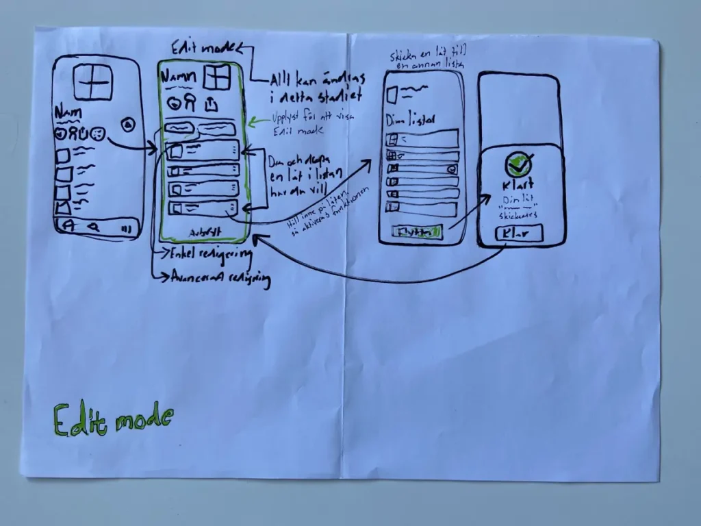
I had to make choices based on the length of the project and what was possible to implement. Two stage edit were more similar to the existing UI compared to Edit mode that would have required me to redesign the whole UI based on that idea.
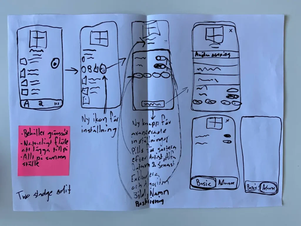
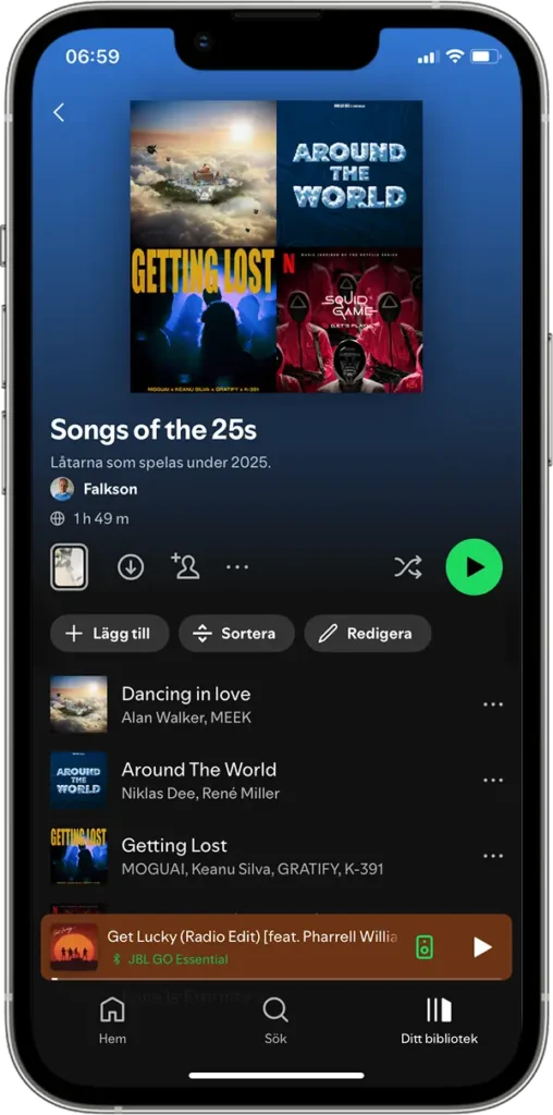
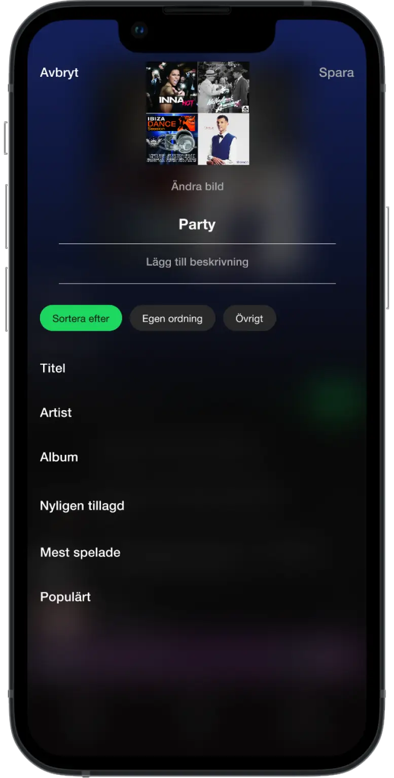
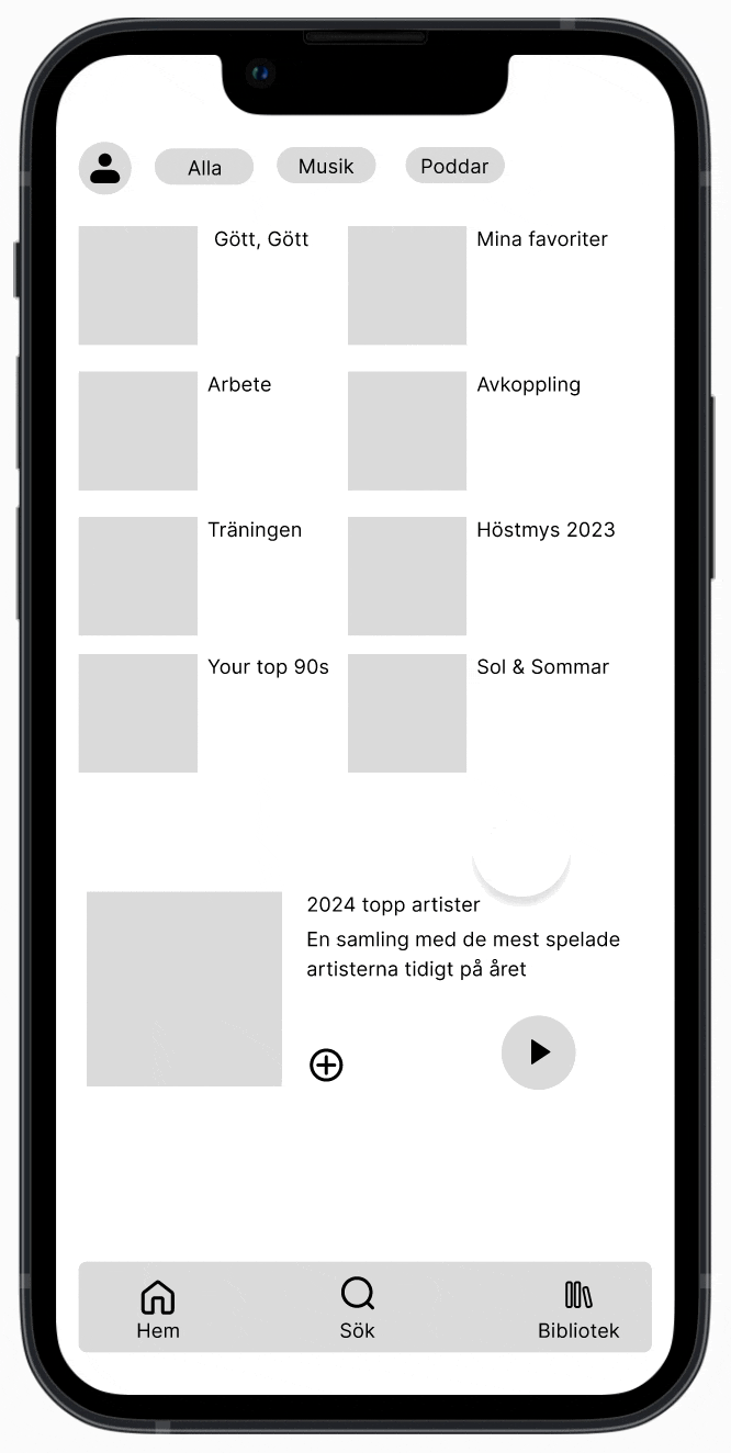
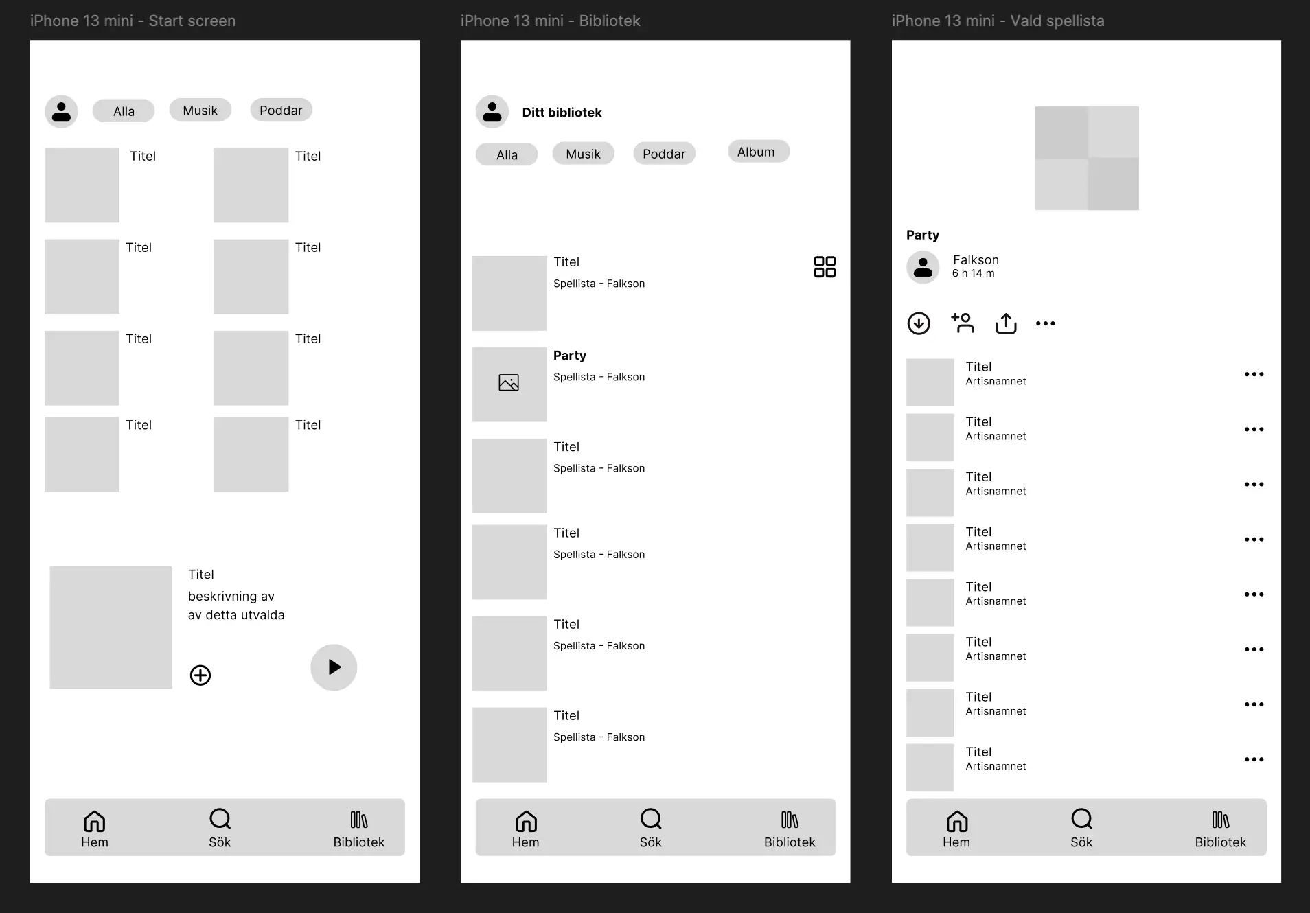
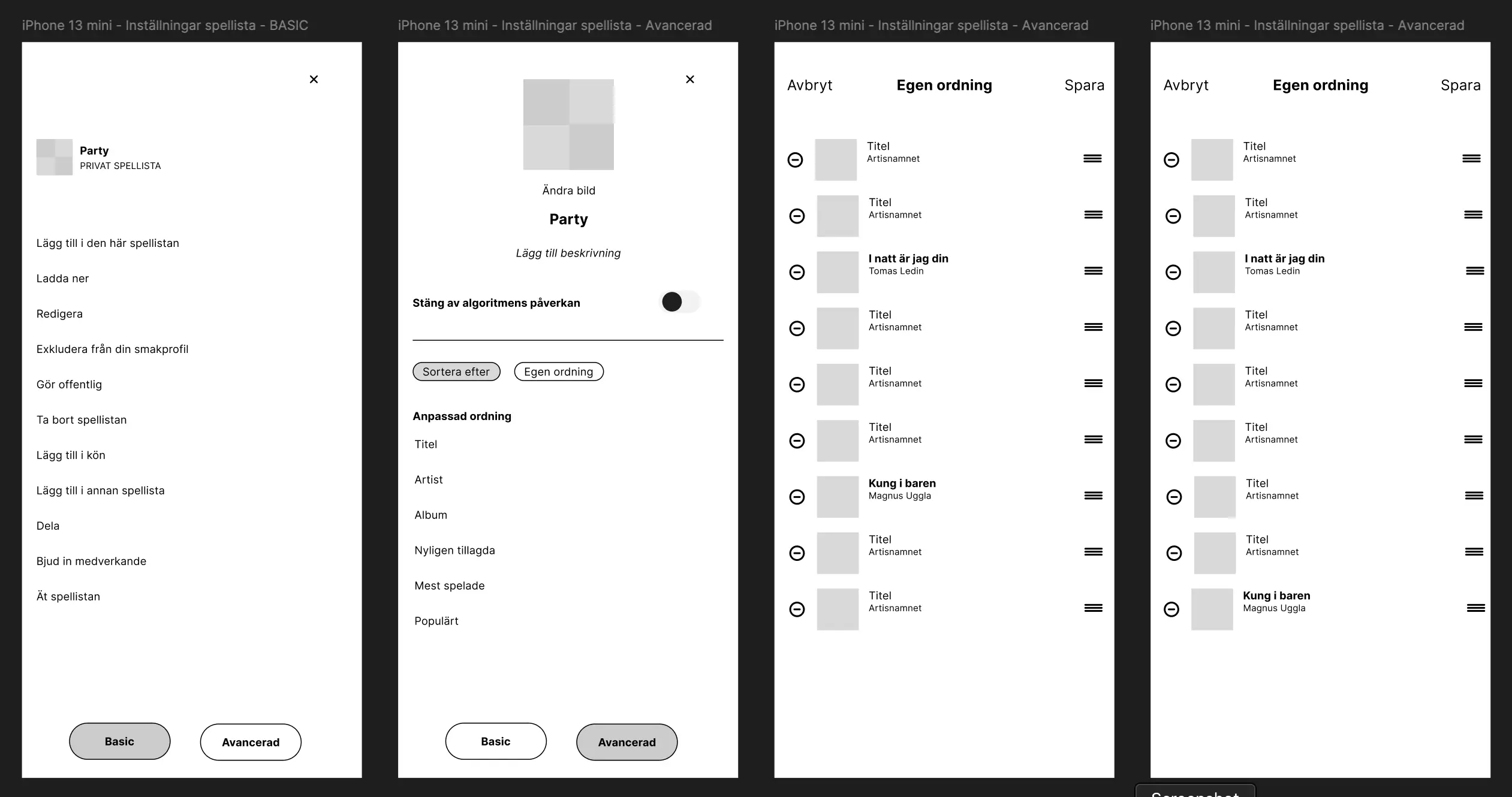
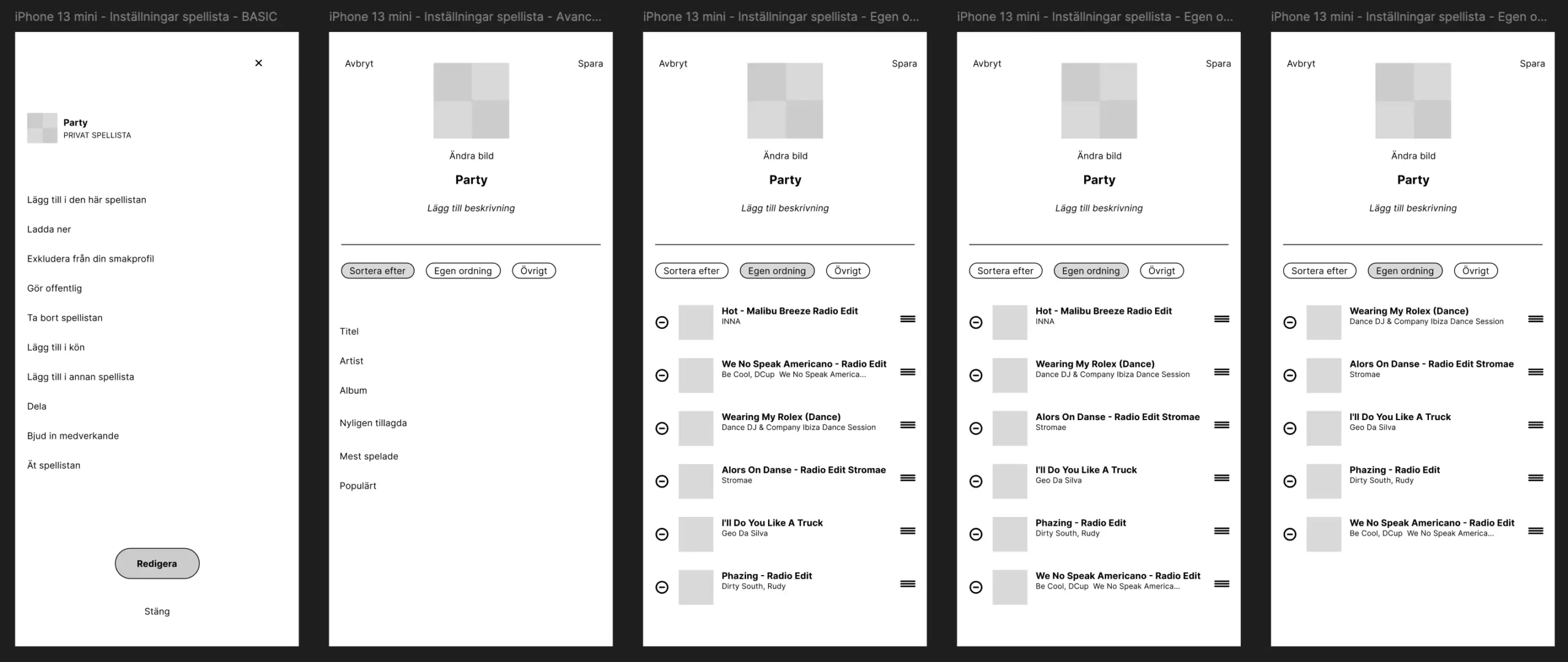
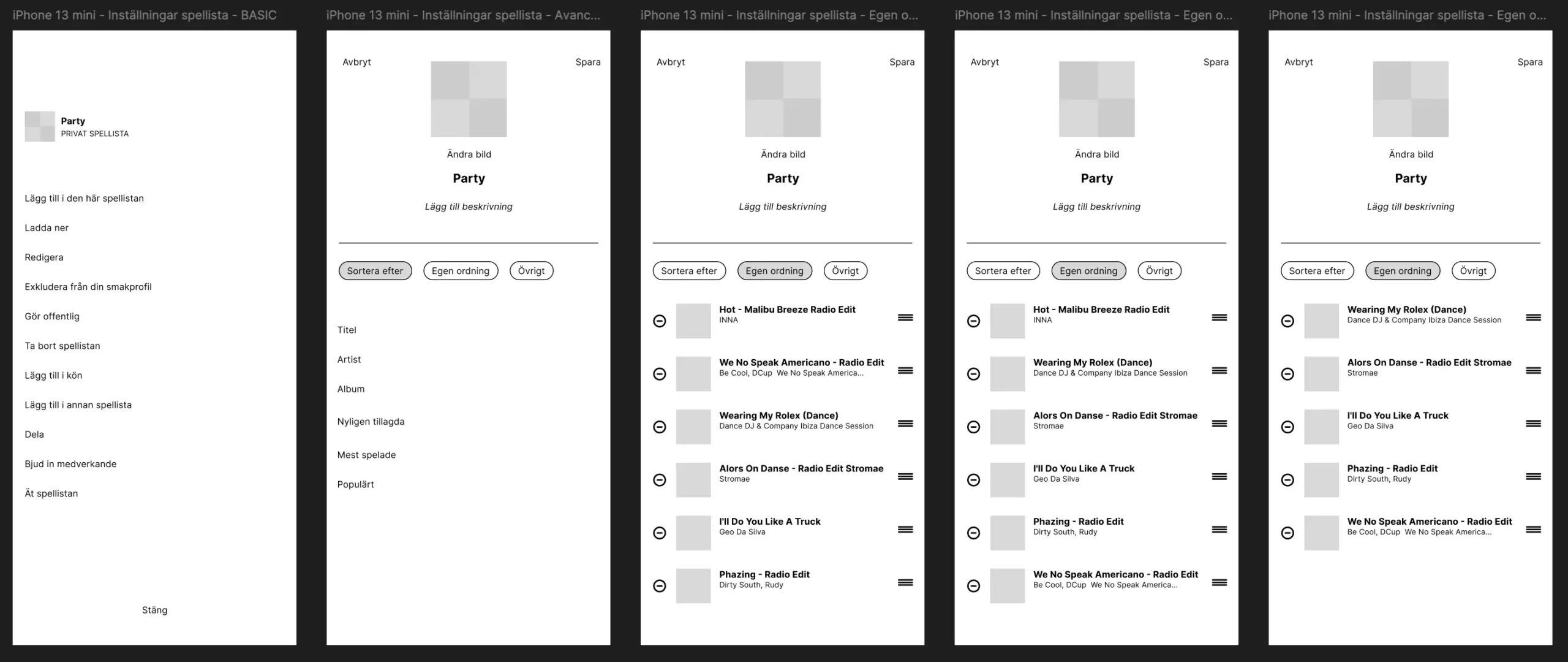
Building upon the existing interface, users can edit a playlist in two distinct steps. They can perform all standard edits, but also choose an advanced mode for more in-depth modifications, such as rearranging songs in any order, deleting a track, and disabling the algorithm’s influence on the playlist. I consolidate all editing functionalities in one place, rather than scattered throughout the app’s interface as it is partially today.
Spotify’s interface transforms into a full editing mode, where users can then sort and organize their playlists and other features. The interface is highlighted in green to clearly indicate that you are in editing mode
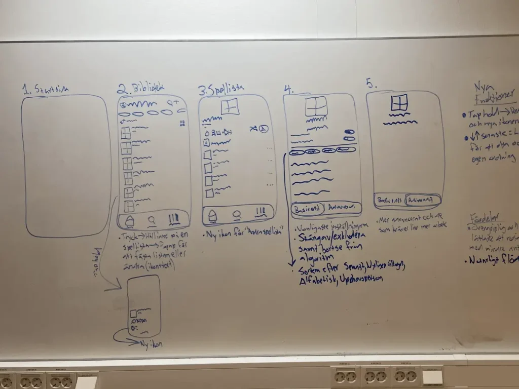
Ideation for concept
7.
Go to the Party playlist, select edit, and sort it by “Recently added”. Then move ”We Speak No Americano” to the bottom, delete “Hot – Malibu Breeze Radio Edit”, and turn off the playlist’s algorithm. Finally, save your changes.
Iteration nr.1
Iteration nr.2
Iteration nr.3
Wireframes and usability test
8.
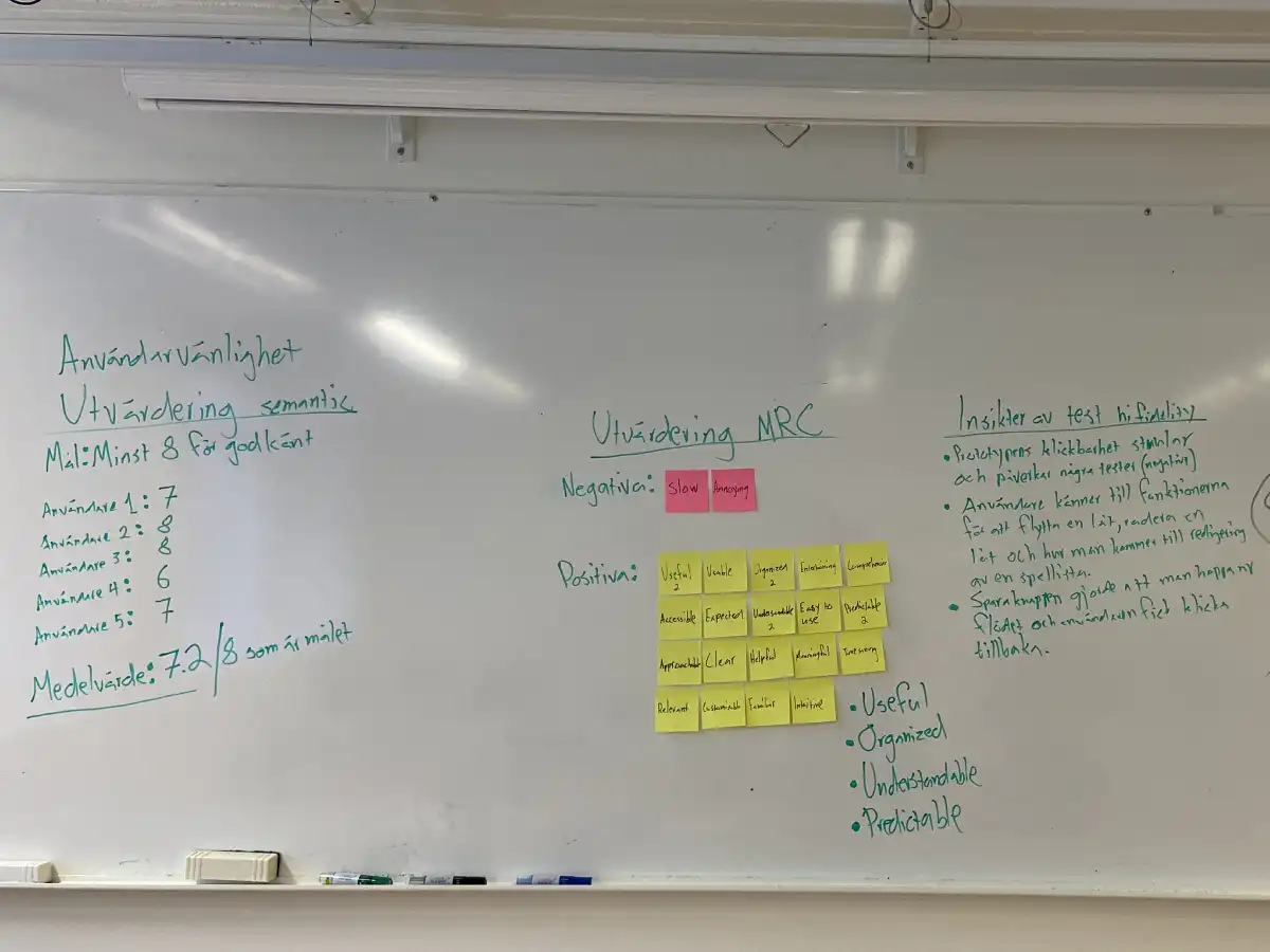
Here is the final prototype, tested with five users, followed by an evaluation using the Semantic Differential Scale and Microsoft Reaction Card. I chose these methods to ensure a score of at least 8/10 for the concept and prototype to be considered successful. With MRC, I aimed to gather positive words from users as they selected five each.
9.
Approaching the project with an open mind allowed users to guide me towards insights and the focus area (playlists). By minimizing my own assumptions, I could develop a more user-centered concept.
I should have validated my playlist insights before creating the Bullseye diagram. In hindsight, some issues I identified were already solvable in Spotify—testing earlier could have led to a different concept.
Spotify’s UI is well-developed and tested. Introducing new button placements and choices confused users, while designs that followed Spotify’s existing structure worked smoothly. Testing confirmed this.
Planning, recruiting, running and analyzing tests is a long process. However, doing multiple iterations showed me how testing brings clarity, unlike typical school projects where we often did just one iteration.
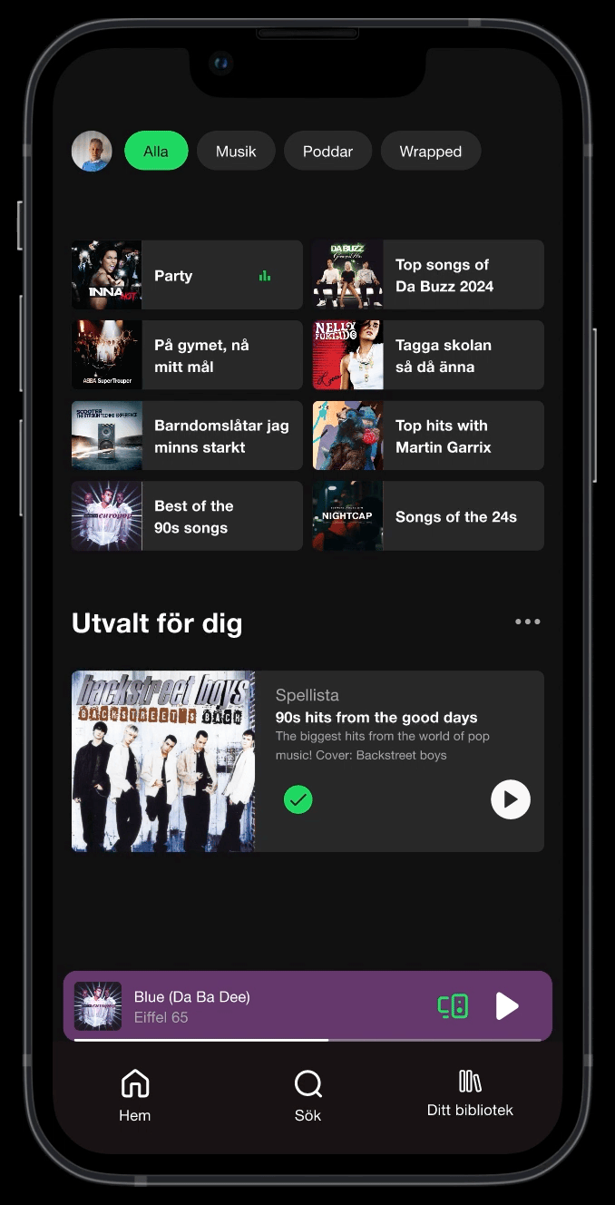
Update – 28/3-25
As a final note, I was happy to see that Spotify had released a new update so the users can sort and organise a playlist in an easier way. Now, the “Sort” button isn’t hidden on the side of the Serach field that you access by swiping down on a playlist.